
Fledger: Your Ultimate Independent Living Tool

User Interface Design
UI Design • Lean UX • HiFi
Solo Master’s Project
April 2022
Through my first step into the world of UI design, my task was to pitch, sketch, and prototype a digital interface that revolved around a domain of my choosing, using Figma. This solo project followed a lean UX approach, applying user-centered design elements in quickfire design cycles which, in practice, would undergo significant research-driven corrections once completed.
As we progressed through the semester, we adapted our interface to the unique contexts and specifications of three platforms: Desktop Web UI, Mobile UI, and Emerging UI. Deliverables and submission criteria evolved as we went deeper into the material and software, so this case study will explore my process through each milestone.
Desktop UI
I kicked off this project face-to-face a blank canvas and minimal direction - a recipe for choice paralysis. The first step towards overcoming my choice paralysis was to take to the whiteboard and begin brainstorming domains that I would be passionate about solutioning for. I ultimately landed on a topic that was all too relevant to my life at the time, which was the young adult transition away from parental dependence and towards independent living. Having already been familiar with what the internet had to offer in the way of digital tools, I decided to formalize my assumptions with desk research. I ultimately came to a pitch that would anchor the scope and direction of my design.
“ At present, digital resources within the “independent living” sphere primarily deliver instructional, blog-style guidance for young adults to turn to as they encounter new responsibilities for the first time (i.e. ad-hoc users). However, existing solutions do not address the needs of young adults looking to also discover, anticipate, and contextualize these responsibilities ahead of time (i.e. ex-ante users).
I will address this gap by building a digital platform that interactively guides users through “essential” categories of independent living, offers tools to track & monitor their progression through these categories, and provides individualized dashboards that use profile data to visualize data & recommend tasks. ”
I would go on to call this platform fledger, a portmanteau of the words “fledgling” (a young bird leaving its nest) and “ledger” (a record of accounts). This identity was inspired by the young adult target audience and the intended use of the platform. I centered the tone and aesthetics of the website around this identity, which evolved with every subsequent adaptation.
To get from concept to storyboard, I decided that the sketching method that would be most logical to me was the building of a website hierarchy. This would allow me to adopt a bird’s eye perspective when designing each page, and make for an easy method of slicing my website into individual storyboards. The result was the following flow.

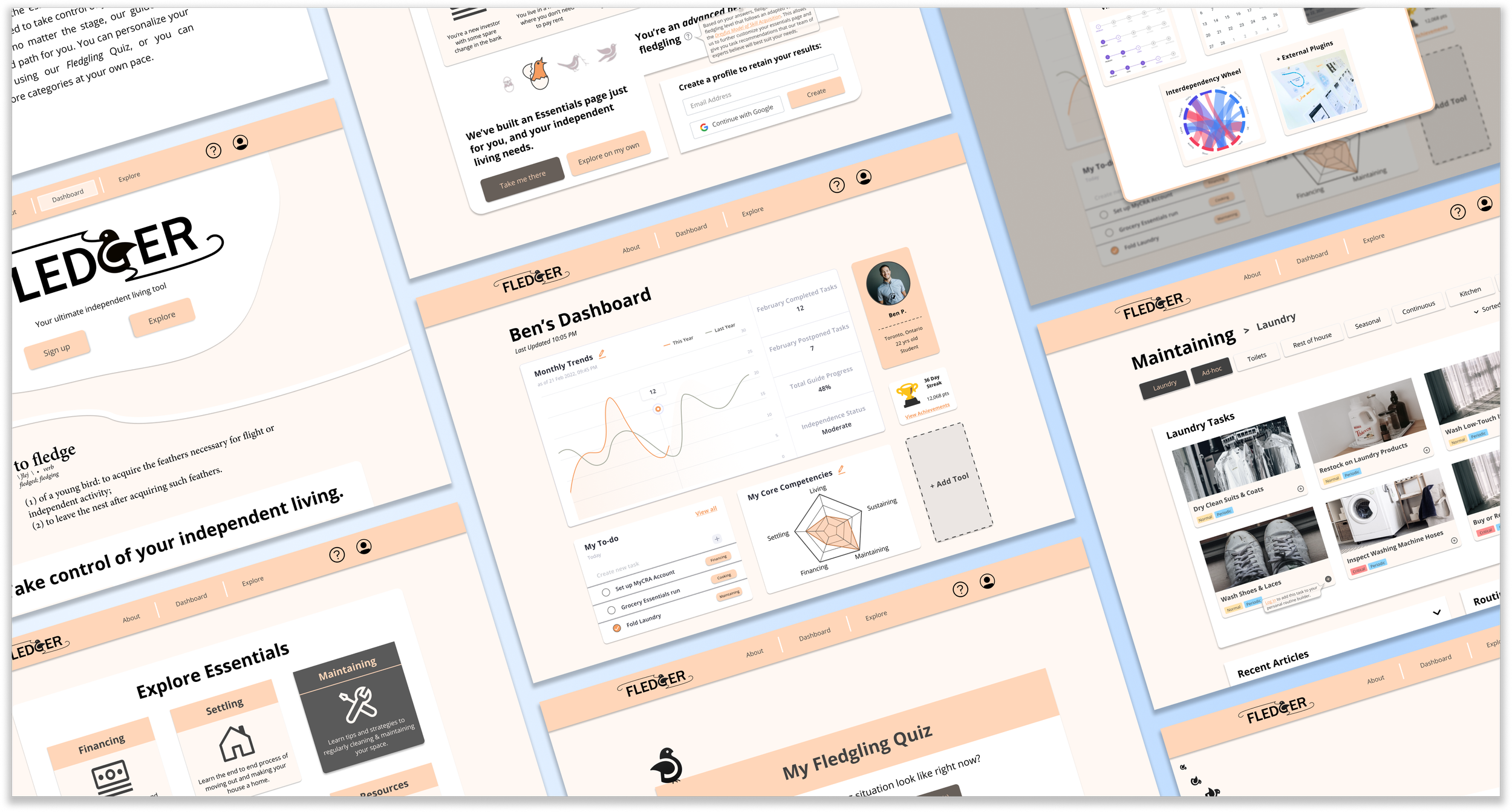
With the pitch and sketch completed, I had lay the groundwork for my interface, and all the was left to do was build it. Since this was our class’s first exposure to Figma, the expectations for the main deliverable were that it (a) highlighted three key functionalities using static storyboards, (b) made use of user-centered hierarchy/elements, and (c) was usable, legible, and accessible.
Here is a sample of some of the screens that were in my final storyboard.
Below is an embedded presentation of the three-path storyboard in Figma. Each storyboard path begins with a title frame, and each screen is followed by a duplicate of itself with annotations overlayed. To move through each screen, you can either left click or press the right arrow key. Don’t forget to scroll!
Mobile UI
In the second instalment of this project, our objective was to build a mobile interface that operated in the same domain as the desktop interface. Rather than port the same design into a smaller screen size, it was important that this interface accounted for the nuances associated with the form factor. This included things like portability, attention, technical specifications, and platform guidelines. Unlike in the first interface, visual aesthetics were also valued in the assessment of this design. This included use of color, type, and composition beyond what is minimally viable. The following is a summary and justification of how I went about this.
“ For the mobile form factor, the emphasis moves away from in depth learning, and towards on-the-go planning. While the desktop dashboard was focused on analytics and visualization tools, the mobile dashboard strips it back to focus on a single gamified analytic and an agenda tool. This caters to the shortened and split attention span of the mobile user, and minimizes the cognitive load that a more exhaustive interface could potentially impose.
As far as “Essentials” categories go, the desktop path incorporated lengthy task descriptions and community discussion, whereas the mobile path focuses more on the ability to quickly find and filter (both mentally and digitally) the tasks that are most relevant to the user, so that they can add them to their agenda and move forward with them as conveniently as possible. Users have the option to read more about fledger’s “Essentials” guides, but this feature is not a part of the main path so as to avoid losing the user’s attention.
A final addition that is unique to the mobile form factor is the user of geolocation to help facilitate the completion of particular tasks. When trying to plan out their tasks, users can look at the “Task Map” to see the establishments nearest to them that could help them complete their tasks. This maximizes convenience and adds another dimension of personalization that cannot be achieved on the desktop form factor. ”
This design was also intended to draw from a robust and reusable design system on Figma that included variants, components, and styles. While these were guided by Material Design guidelines, every design decision was made with the target user and functionality at the forefront.
Which brings us to the interface. This time around, I built out one single static storyboard that I could explore deeper than in my desktop interface. In this storyboard, I got to the three main functionalities of fledger, but specific to the mobile user. I start the user from the very first onboarding screen, and guide their journey to taking control of their independent living.
Here is a sample of some of the screens on my storyboard.

Below is an embedded Figma page that shows the storyboard alongside its annotations – this time, outside the frame, to enable easier internal communication of the design elements. Use the on-screen navigation guidance to move through the storyboard from left to right, starting from the “play” icon to the “stop” icon.
Emerging UI
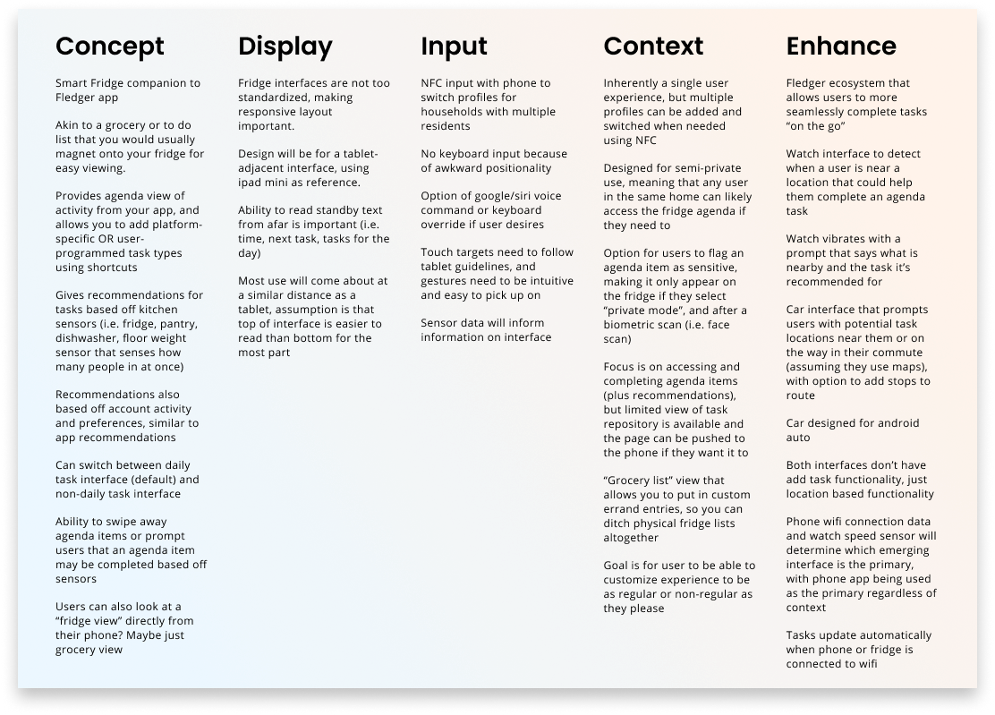
In the final instalment of this project, I was tasked with building an interface designed for an emerging technology of my choosing. Once again, this choice of interface came with a myriad of new user-centered considerations – such as display sizes, distances, input modalities, and contexts. While a more creative lens was afforded here, adherence to standards for our technology of choice was still important. To stay true to the concept I had already began to explore, I decided to build a kiosk interface designed specifically for a smart fridge.
I was drawn to the door of the refrigerator and how it has long been a medium for miscellaneous reminders and to-do lists held up by an assortment of magnets. A core part of my value proposition with fledger was giving users a companion that would help them track their “essential living” progress on a day-to-day basis, making this interface perfect for it use. As an enhancement to my project, I also began exploring how this same concept can be applied to a smart watch – building a fledger ecosystem of sorts. I took to the digital whiteboard and jotted down key ideas for how I would adapt my concept to these new requirements, and this is what it looked like
With that, it came time to build the final deliverable. As with the previous milestone, the interface was expected to draw on a robust design system and make maximal use of Figma’s design tools. Because of the unconventional nature of this interface(s), the static storyboard takes some creative liberties in exploring some of the proposed concepts. Below is an embedded page that shows this storyboard in its entirety, with annotations below each screen. Use the on-screen navigation guidance to move through the storyboard from left to right, starting from the “play” icon to the “stop” icon.
Accompanying this storyboard is a clickable demo of the fridge interface, including micro-interactions. The clickable elements on each screen are intended to take you down a specific semi-linear path, so feel free to click around to prompt the on-screen guide. To override the intended path, you can use the arrow keys on your keyboard to move forwards or backwards. Enjoy!
Wrap-up
This brings us to the end of this case study. On the whole, I found that taking this on individually was valuable for discovering my own design process and building my technical toolkit. That said, the lack of a team perspective or available user data definitely made me prone to falling down rabbit holes and failing to reflect on some of my design decisions. Surprisingly, my general inexperience with Figma coming into this was not as big of a hinderance as I had initially assumed it would be, and I found that the quality and efficiency of my output grew significantly with more hands-on time with the software.
I undoubtedly have a lot to learn and fine-tune in my process, but despite this, I came out of this project proud of my designs. As far as future directions go, validating my prototypes and assumptions with in-depth user research would have allowed me to take this project to the next level. With a strong and diverse team, meticulous usability testing, and more Figma experience under my belt, I’d be very excited to see what fledger 2.0 could look like one day. More than anything, I am grateful for the opportunity to have built on my UI skills through a project that I am passionate about!
